A Method for Creative Paper Map Design
When designing a new map for your game, it can be extremely difficult, sometimes paralyzing, just trying to figure out where to start. Especially for a designer that's not an "idea guy". You know those people, and if you're not one of them, you're probably pretty jealous of them. They seem to have a never ending flow of ideas when just squeezing one or two out on your own can be exhausting.
Full disclosure: I'm not an "idea guy". That said, designing video games demands creativity and innovation, so I've spent a lot of time developing methods to help generate unique ideas when I'm feeling a little stuck. This method I've described below is one that helped me on the level design front and it starts at the very beginning with your paper map.
Generating a Paper Map Palette
Early on during the development of Star Wars: First Assault (an 8v8 multiplayer FPS), we kicked off an exercise where EVERY designer on the team was required to generate one paper map per week. Even the systems guys. It was an incredibly valuable experience for all of us to discuss map design philosophy, game modes and better understand how our gameplay systems were affected by the environments. Not to mention, we were a new team and this was a nice way to start building trust and respect for each other.
Examples of some amoeba tracings.
After getting through about 4 maps, I found myself struggling to come up with new ideas. Like, I didn't even know where to start putting my pen to the paper...or rather, my mouse to the Visio diagram. There weren't any restrictions given to us and the blue sky was a little too wide open. I felt like I needed to box myself in a bit more or place a frame around the map so that I had some direction out of the gate. I actually find that I thrive when I'm given the right amount of restrictions. It forces my brain to enter areas it wouldn't normally go.
Another problem I was having was that I couldn't create organic looking maps. Everything was super boxy with straight lines because, first, I'm no artist. Second, I'm not very skilled with programs like Adobe Illustrator that allow for more free form design. After thinking about it for a while, I wondered...maybe I could create a palette of shapes to use like stamps on the map? If I wanted to do that organically, maybe I should start with some simple organic shapes? Like amoebas?
So, I started searching Google Images for amoebas. I found a bunch of shapes that were all really different and then traced them out in Visio. This created a palette that I could use to build out the skeleton of a paper map. First, I chose one of the shapes to define the map boundary. Then, I used the remaining shapes to represent other structures within the map. I was pretty stoked on the results! I went from having zero ideas and really boxy maps to something much more interesting!
This map was built using 8 amoeba tracings, including the boundary. Some are repeated more than once.
Added some layers and filler shapes.
Solidifying the Process
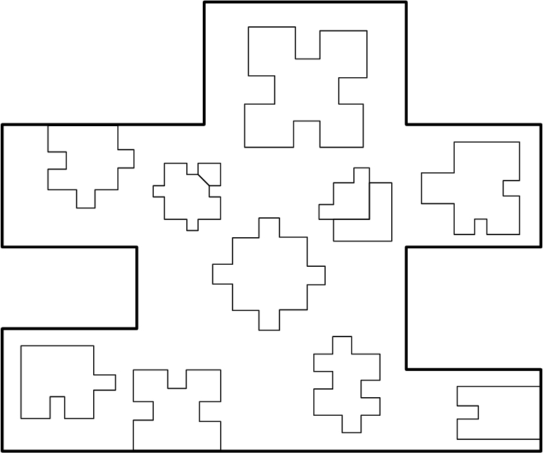
Alright, so that worked pretty well, I thought. But is it flexible and expandable? For my next map, I decided I should test the process again, but this time with a more inorganic map. So, I went looking for inorganic shapes and I landed on puzzle pieces. There's almost an infinite variety of them and they seemed to lend themselves pretty nicely to building out urban cityscapes. Here's an example of the first map I created using puzzle pieces.
This map was built using 7 puzzle shapes, including the boundary.
Again, adding some layers and filler shapes.
Here's another one that's a little bigger.
Basic shape placement.
Now with details.
Give It A Try!
Though I did eventually build these out in 3D and playtested them with good results, since Star Wars: First Assault was canceled and I spent my time on Halo 5: Guardians solely doing Systems Design work, I've never actually shipped a map using this method! I would love to see what y'all can come up with. Tweet me @Ryan_Darcey with images of the maps you create using this process and lemme know how it goes for you!


